Creating a logo for a new project is always fun. So I started working on one myself.
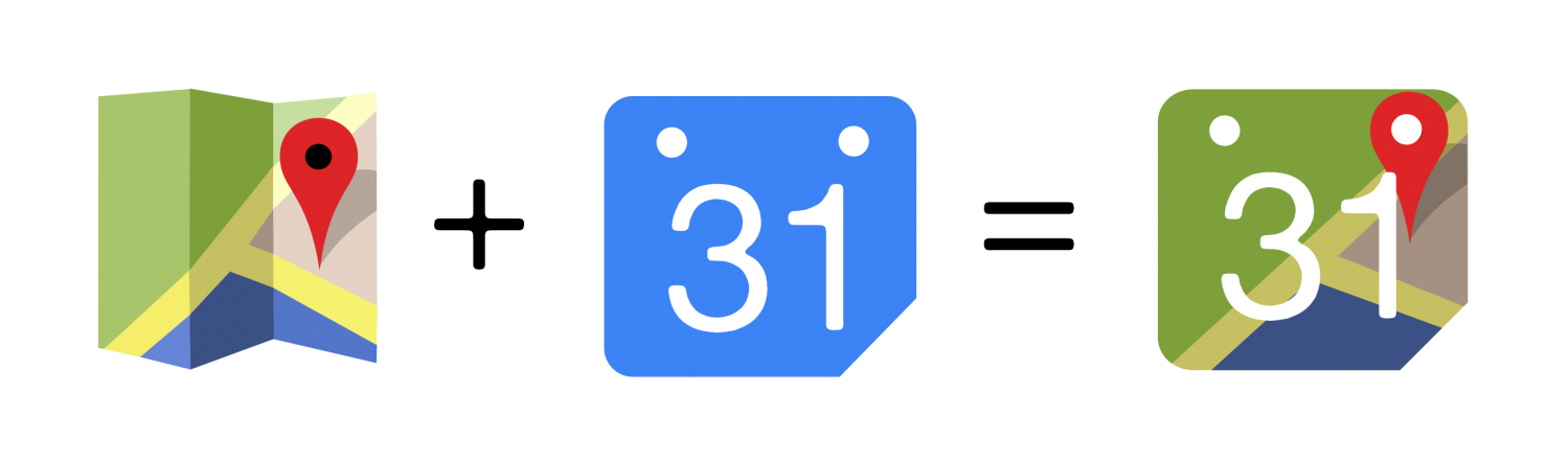
As the main concept of MapTiming is about combining map data and calendar data in one app, and because much of the underlying services are Google’s, the approach is obvious. I made myself a blend of the Google Maps icon (without the Google ‘g’) and the (old) Google Calendar icon (with my own preferred font ‘Alte Haas Grotesk’).
I hope this won’t get me in any copyright issues, but I guess I’m fairly safe.
[UPDATE] The logo design is updated with another font and brighter colors: