MapTiming is a repository and publication platform for event data. It combines location and time. The basic interface is a map showing where the events take place, with extra functions to filter on the timeframe or on tags.
This post is about some decisions that I took for designing the basic user interface.
Optimize for clicks or for screen real estate? This is the dilemma between a dropdown menu and a menu bar. The menu bar has all options available in a single click, but it takes quite some space. The dropdown menu takes less space, but it requires an extra click to open the menu before selecting an option. I decided to give the screen real estate criterium priority. The user wants information, not menus, so the design should make all options readily available, but without being obtrusive.
Responsive? Mobile and desktop users are equally important. Complex user interfaces can be made responsive by reorganizing the layout or by changing the way of interacting with the user, depending on the screen size. That can be confusing for a user who’s using the app on multiple devices. Better still is to design the user interface such that it doesn’t need responsiveness!
Style? This was an easy question! I’m already using google services like maps and fusion tables. I’ve designed the input form based on google calendar’s input form. Google I/O 2014 presented Material Design, backed up by a whole set of resources for applying the design principles. The choice is made! But I won’t be using Polymer, because it’s only supporting the most recent browser versions. I also won’t focus on animations, although it’s one of the core concepts of Material Design.
At this moment I’ve been designing the user interface on the drawing board. I’m using InkScape for this. Material Design is not using fancy shapes or textures, so it’s very easy to draw realistic GUI mock-ups.
Showtime!
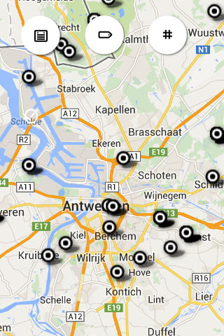
This is the basic user interface. Maximum real estate is reserved for the map. The functions are available through three of these fancy round Material Design action buttons. The default button color is white, what may look strange, also looking at the eye-catching colors used in the google design specs, but they’ll get colour once they’re activated. The function of each button is indicated by an icon (aligned to the google design principles).
![]() a calendar indicates the ability to filter on timeframe
a calendar indicates the ability to filter on timeframe
![]() a tag indicates the ability to filter on tags
a tag indicates the ability to filter on tags
![]() a hash character indicates the ability to do a search based on hashtags
a hash character indicates the ability to do a search based on hashtags
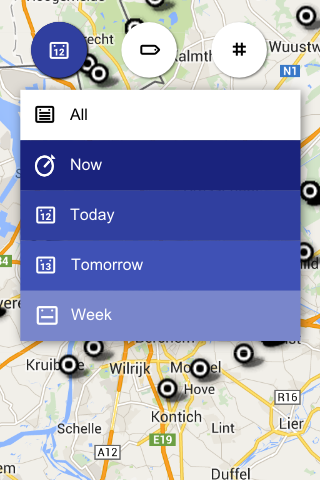
Touching the calendar button displays a menu where a timeframe can be selected. Each option has a different color, picked from a gradient defined in the google design specification. Dense colors limit the set of visible events and white shows all events. The selected color will be reflected in the button, together with the dedicated icon, so the user can read the current setting from the button. The option to show current events (“Now”) is put on top, because that’s most likely the first option a user may want to try out and if that does not return any results, a broader timeframe can be selected (or the map can be zoomed out).
![]() events happening now
events happening now
![]() events planned for later today
events planned for later today
![]() events planned for tomorrow
events planned for tomorrow
![]() events planned for the coming week
events planned for the coming week
![]() all events
all events
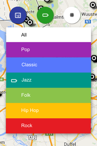
Touching the tag button displays a similar menu listing the predefined tags. Each tag has a color, picked from the set of base colors defined in the google design spec. Distinctive colors are chosen because the options typically return distinctive sets of data. Also here the selected color is reflected in the button and white indicates that no filter is applied. A regular user may remember which color matches a certain tag, so he knows what filter is applied without opening the menu. I consider to limit the number of predefined tags to six, not to mess up this gui concept.
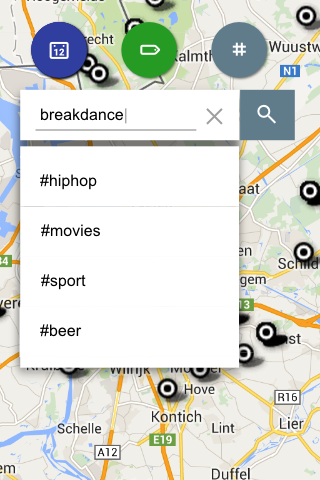
Touching the hash button displays a search box where the user can type a hashtag to filter on. The picture shows a menu appearing beneath the search box, listing a number of hashtags to select from, but I’ve not decided yet how to populate this list. Should it be a static list showing the most popular hashtags in the database? Or is it more useful to implement a find-as-you-type field? When a filter is applied, the button turns from white to blue gray.
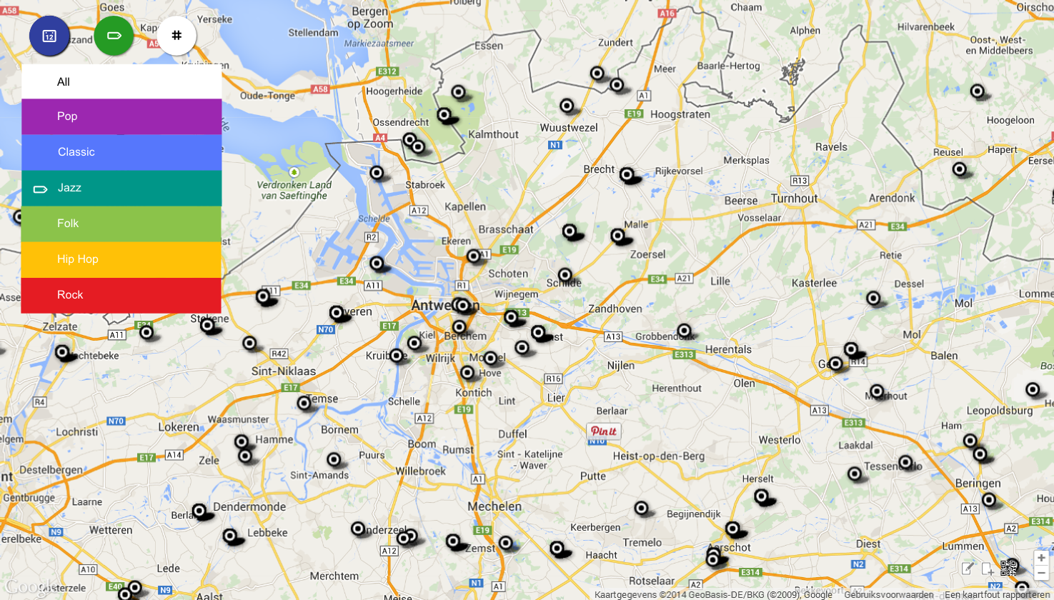
The layout is deliberatly kept condensed to fit on a mobile phone, but there’s no reason to blow it up on a desktop screen. The three action buttons will go to the top left corner of the screen and the rest of the display is available for the map, just like google maps does it. Controls for functions that are less often used, like adding or modifying events, are located in the bottom right corner and have transparant buttons, but there’ll be more on those in future posts.
My only worry are the markers on the map. As I’m using a fusion tables layer to render the markers, I’m stuck to a set of markers to choose from that seems to be drawn in the stone age… The only way to get something more up-to-date is to switch to native google maps api markers, but that’s a major redesign of the code… It’s on the roadmap as part of Plan B, for if Google decides to ditch fusion tables alltogether…
Here is some material that may be helpful for your own Material Design work: download the complete SVG file, containing all mock-ups, icon designs and notes (you need to have the Roboto font installed on your system!)

